Koko Bright
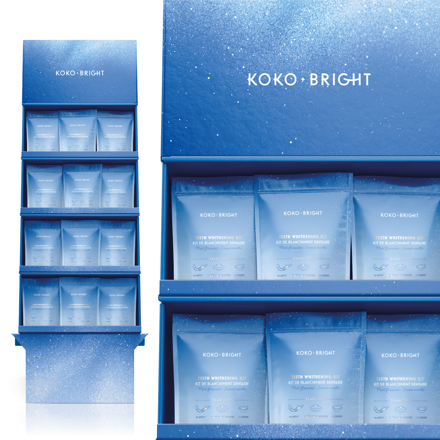
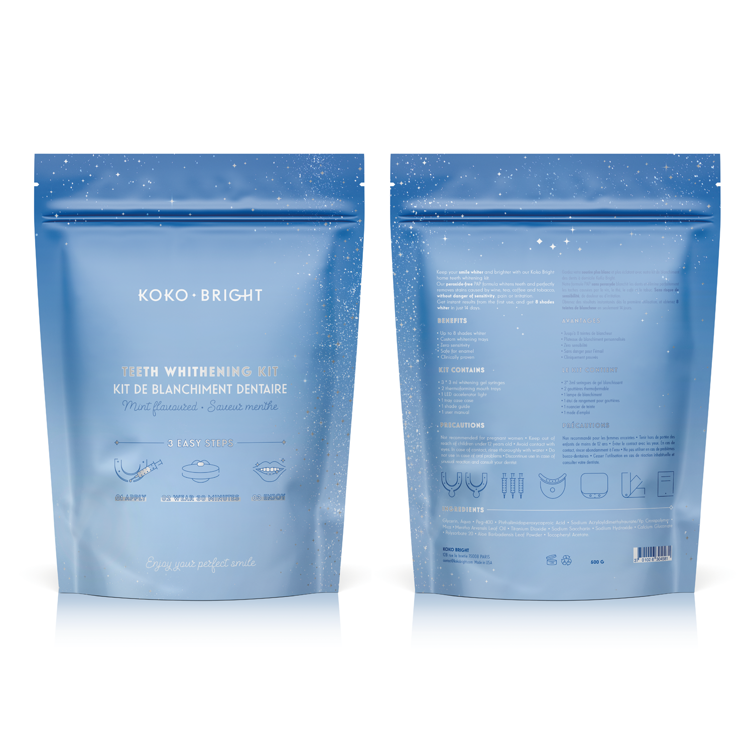
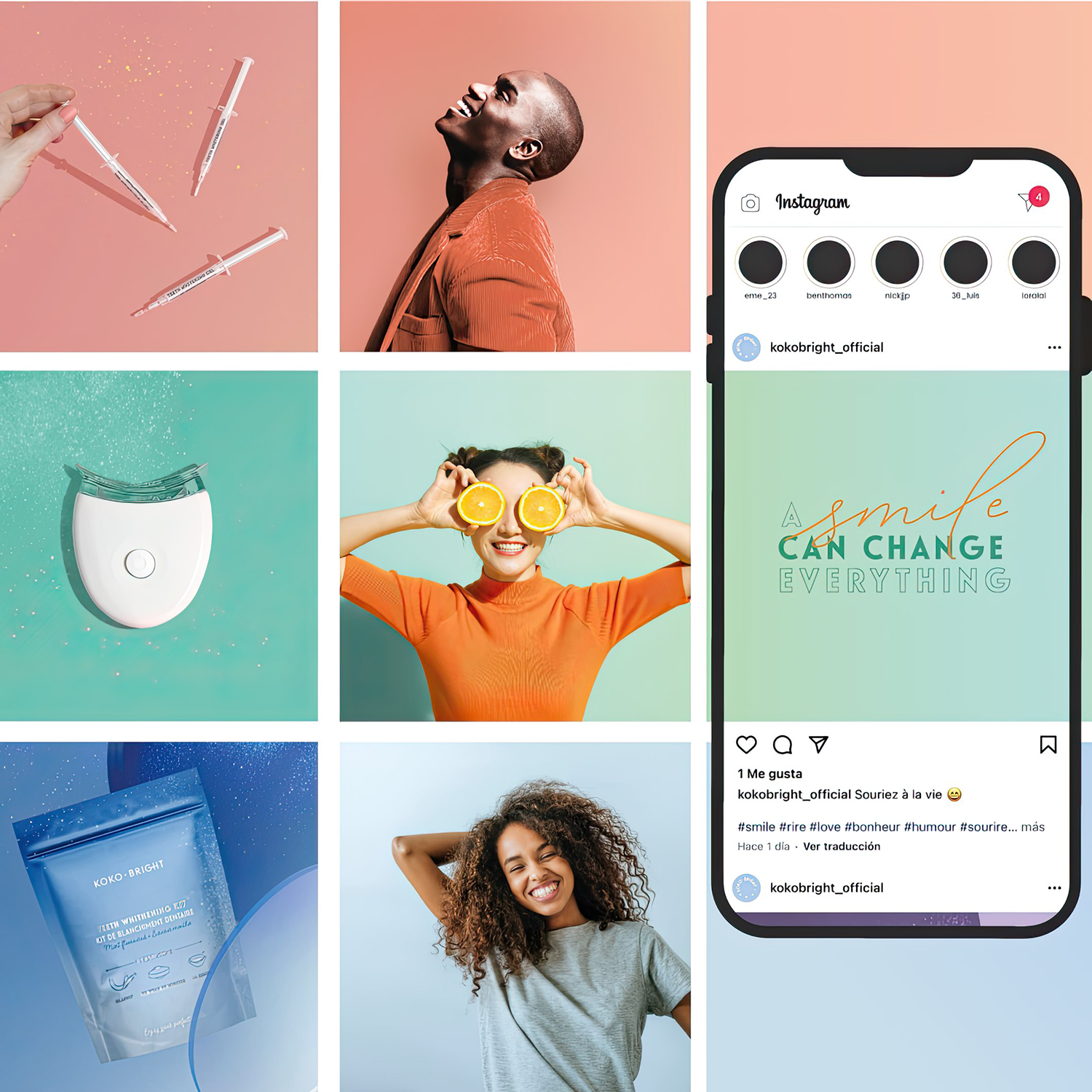
Creation of the logo, visual identity and packaging for Koko Bright: a new French unisex oral hygiene and teeth whitening brand whose first product launched is a teeth whitening kit.
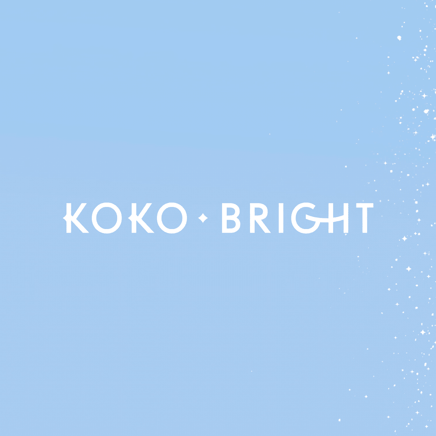
The brand wanted to avoid a cold and purely medical design and sought, above all, an elegant and aesthetic design that would reflect the brightness and shine of the teeth. This is reflected in:
– the symbol: a smile that passes through different shades of white and glows (in the form of flashes), specifically five, like the five lights of the LED whitening machine.
– the logo: dynamic that changes its brightness and glow (in one of its versions) and whose customised typography makes it unique and memorable (the union of the G and the H draw a smile and the K makes a subtle reference to the shape of those flashes).
– and the background image: colour, sparkles and gradients that reflect the cleanliness and whitening action of the brand.
Creating overall a unique visual universe and a brand with its own personality, ready to stand out ✨
Client
Koko BrightGraphic designer
Elisabet Sanchez BoixDate
enero 1, 2022